2022 Design Predictions: a Juxtaposition of Future-facing Retrospective Visual Art
- Dave Moyer

- Jan 27, 2022
- 6 min read

Each year around this time, we designers look out at the horizon searching for the next ‘defining spirit’ of our collective aesthetic ethos. What’s coming? Where will it lead? How did we get here? We hope to billow our sails on the rising winds and catch the current toward new avenues of expression through visual media, while also helping to establish them.
This current reflection point finds us two years into a future filled with uncertainty, wondering when things will get back to normal across how we work, communicate, shop, go out into public, educate younger generations and more.
The tonnage of living in this limbo has led to a shared nostalgia and lean into escapism, looking back to times free from the expectations of constant connectivity and innocent of the knowledge of lockdowns — something more organic and tangible.
And yet, at the same time, we cannot ignore what we know now, the progress that lies ahead, the equality and equity that we aim to achieve for all.
This Möbius loop of forward-thinking retro juxtapositions and reactions to the last 24 months of present purgatory is seeping into the design world through a return to Lo-fi sensibilities, bright palettes and serif-heavy, font-forward compositions while also reimagining these past gems through 3D animation, immersive digital experiences, and careful thought around diversity and inclusion.
Let’s take a look at these and other trends to expect in 2022…
Retro is dead. Long live Retro.

This vein of nostalgia is all too reminiscent of when the ‘90s emulated styles two decades its senior — the world of Dazed and Confused and That ‘70s Show — giving a fresh feel to forgotten trends by reimagining them through our contemporary perceptions.
For us Y2K kids, our childhood is coming back in full force with the clean, bright color palettes and Lo-fi stylings of the late ‘80s and early ‘90s — a time when Zack Morris first answered the call on his brick phone and the Internet began to influence design with clipart, 8-bit and vectors.
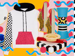
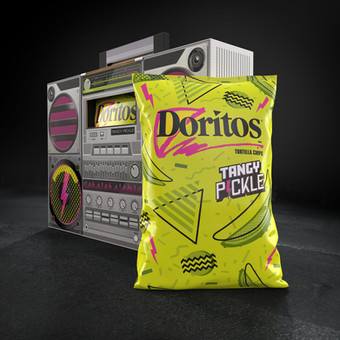
We’re seeing neon blasts and pastel haze intertwining with other former fads, such as the loud ‘80s style of the continuously trending Memphis design. On one hand you have clean and flat and on the other grainy pixelated landscapes.
Also, expect to see a bit of grunge creeping back in, a rebellion to the flat, bold, fluorescent style as things continue to evolve toward Antidesign and maximalism — oversaturating the senses with bold color combinations, high-contrast patterns, layering and repeated motifs — and combining the best parts from all.
Where can you find this out in the wild? We’re already seeing it pop up in campaigns from brands like Twitter, Doritos, St. Laurent and even surprisingly IKEA.


The mighty serif returns with a font-forward outlook
Typography is so often a determining element in design work, but has been viewed for some time as a component to be planned around, rather than showcased. Fonts are no longer content playing second fiddle to other visuals and will push their way back into the spotlight as a lead character in layouts.
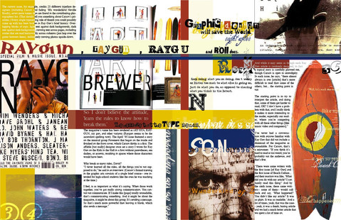
Drawing inspiration from David Carson’s Ray Gun magazines toward non-traditional expressions, type collages and other text-heavy mania, we’re seeing big, bold ads putting fonts forward and sometimes over everything else.
This sentiment will also start to lean into another seemingly forgotten player from the past — the serif.
A few years back, serifs were persona non grata. Preferred fonts came sans the decorative strokes finishing off the stem of letters. Bold, clean fonts like Futura, Gotham, and Helvetica took center stage. It’s a bandwagon that many brands hopped on in the latter half of the last decade, and can be seen prominently in examples like the Mad Men title treatment or Google’s logo update in 2016.
While serif fonts were usually representative of tradition and conservative leanings, this new wave of flourish-wielding font treatments will move into more expressive and less stale approaches. As this “soft-serve” type trend continues, expect to see designs exploring different weights and visionary stylings, if you haven’t already.


The intersection of technology and artistry
So, now that we’ve reminisced on the past, it’s time to look forward at the effects technology and modern considerations will have on the industry.
All manner of new digital advancements are flooding the market. You can’t not talk about the Metaverse and its impact on design. Virtual reality (VR) and augmented reality (AR) are already top of mind, and beyond the domain itself.
We’re shifting into fully immersive experiences delivered directly to our homes, mobile devices, VR/AR etc. — and eventually out of home, once we emerge from the extended confinement of the last two years.
Motion added to print graphics AR environments. Digital fashion fittings and samplings as at-home experiences. People aren't going to malls anymore, so there’s a big push to create 3D catalogs, allow users to try on clothing virtually and more.
The tools needed to support these trends are growing in scope and accessibility and tech is ready to supply it. Apps like Procreate, Nomad Sculpt and Shapr3D are now extending 3D capabilities to iPads — including the fusion animation and motion graphics. Where in the past you needed an entire suite eating up gigs of RAM installed to your desktop, now you can unlock these functionalities from a mobile device for around $6-$30 USD.
The technical evolution is granting designers greater agility, mobility and dimensionality — bandwidth permitting.
Accessibility, inclusion and diversity in design
Brands everywhere are building more inclusive experiences for customers and staff across policies, hiring and education… but also design.
And, not only are these brands working to represent a cornucopia of heritages, body types, backgrounds and beliefs, they’re also striving toward a more accessible design experience.
There’s a demand to look beyond the aesthetic and consider how designs will be viewed (or not be seen) by those struggling with various forms of color blindness, total blindness, hearing loss or other impairments.
We’ve run into this in our own projects where designs were revisited to introduce more color contrast. You can’t have a deep gray on a black background, for instance.
Other similar sensory considerations include the need to develop presentations and websites that are screen-reader capable. Taking into account the size and contrast of things is important, but also the order that items are added as layers to a presentation. If done out of order, it can affect how they are picked up by screen readers across programs like Microsoft PowerPoint, Google Slides or Apple Keynote programs.
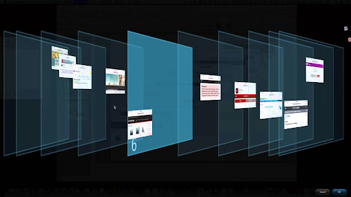
How items are placed on a slide doesn’t always translate into the way they will be presented. If you want the headline of a slide read first, then it needs to be layered on top and then subhead then body, then supporting images and so on.
PPT has a matrix view that expands into a 3D layout to display the planes where each element is in order. But, this functionality operates differently across other systems, so you have to be proficient in those needs across programs.
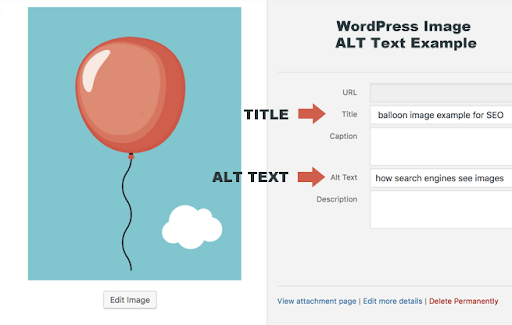
Speaking of images, mapping in Alt text is critical to ensure that visually impaired users know what an image is displaying, even if they can’t see it. Image descriptions should be written so as to represent the literal visual itself — not necessarily the intent or connotations.
Designers working in presentations need to be educated on and stay mindful of these backend needs in order to facilitate a more accessible and inclusive experience for all.


Educating the next batch: advice for fledgling professionals
Sounds like a lot to be on top of if you’re just breaking into the design industry or trying to get a competitive edge by learning new skills. Advice for fledgling design professionals:
If you’re looking to be a motion designer, or up-level your game, look into integrating 3D into your portfolio.
In general, expand your knowledge of more collaborative toolsets. Platforms like Figma and InVision allow for real-time collaboration across design, web, marketing and other teams involved in the creative process, and are becoming an industry standard.
Partially due to the nature of our remote work environments, tools that allow for holistic feedback and shared access are gaining traction, while also removing much of the excess formerly involved in versioning, review cycles, and so on.
The constancy of change
Styles are constantly evolving, but now it seems like the cycles are happening faster and faster. It makes sense that as technology and design become more intertwined, the principle of accelerating change will bleed into creative realms as well. For instance, gradients were frowned upon just a few years ago, and now they're bad again before they really picked up again.
Many of the graphic design trends mentioned have already made an impact in 2021 and will continue to challenge, enhance and stretch the way we design throughout 2022 and beyond.


Comments